should
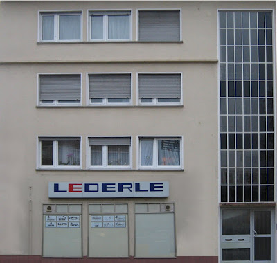
In the fifth exercise (in my case I had to make the exercise alone, because my training partner has given up his studies), we are in two groups, one of the specified places in search for Neustadt ad Weinstrasse make on-site pictures of the facades of the buildings and straighten this with Photoshop. I opted for the old gymnasium.
Since my version of Photoshop (Elements) can not deal with prospects, I have done this exercise on the Mac with Gimp. I initially imported the pictures in Gimp, with the poly lasso surrounds the cladding, cut and pasted into a new file. The equalization of the facade is decorated with the Gimp something different from Photoshop. Why not use the Edit Perspective, click Select, then in each corner and then drag it to an auxiliary line that appears exactly vertical or horizontal. This allows to equalize the facades of more accurate and make small corrections.
was off the facade, of course, disturbing objects such as branches of trees that juts into the picture, people or cars passing by just as in the middle of the old sports field is a parking lot. These objects had to be retouched. It could work for smaller things with the Clone Stamp. For larger corrections, but it was simple, a piece of facade, above which no disturbing objects were cut, and then set about it on the other surface. Some areas could also be mirrored and then placed on the opposite side.
In this way each image has been edited by little.
were then stored the images as. Jpg files.
single example:
original:

corrected image: To compare

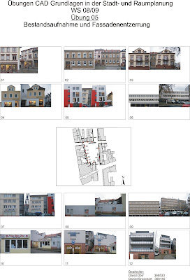
To the original images and the equalized facades, they were on compared with a plan that was plotted later. On the plan nor a card came in the middle, where I the locations of which I had made the pictures drawn and numbered in order they are clearly established.
The plan (in pdf format. And when. Jpg) and two folders, one with the original images and one with the equalized facades, was burned to a CD. For this CD was still a cover designed and delivered all together.
The finished plan:

Conclusion:
The equalization of the facade was a lot of fun. Since I already had the postcard in Exercise 03 (The postcard "objective view") made with Gimp, the exercise was not a big problem. Working with Gimp I find it much easier than with Photoshop and you can do much finer work. The function change in perspective to see the images in Gimp is solved much better than Photoshop. I will probably continue to work better with Gimp, because I've gotten used to the program and I find it much better deal and can handle it.
0 comments:
Post a Comment